08 Beer |
Craft Beer
ROLE
- UX/UI Design
- Responsive Web Design
- Rebranding
- Visual Direction
- Packaging Design
- Design System
- 3D Product Rendering
- Video Editing
DELIVERABLES
- E-commerce Website (Mobile & Desktop)
- Information Architecture
- Wireframes (Mobile & Desktop)
- Design System — Fermentation Design System
- Visual Identity & Logo
- Packaging Design
- 3D Product Renders
- Accessibility Documentation
- Final Presentation Video
DATE
January — April 2025
Academic Project —
Individual Project
How can a local craft beer brand strengthen its digital presence and connect with younger audiences without losing its traditional and territorial identity?
08 Beer is a responsive e-commerce redesign for a Barcelona-based craft beer brand rooted in tradition and proximity.
The project modernises the brand's visual language and digital experience while reinforcing its connection to local culture through product storytelling, accessibility-focused UX and a clear, engaging navigation system.
CONCEPT
The project is built around tradition, proximity and belonging.
The name 08 — inspired by the postal code of the Barcelona province — becomes the core of the identity, positioning the brand as a representation of its territory.
IDENTITY &
BEER SYSTEM
The identity system was designed to balance tradition and freshness while allowing the brand to grow through product differentiation.
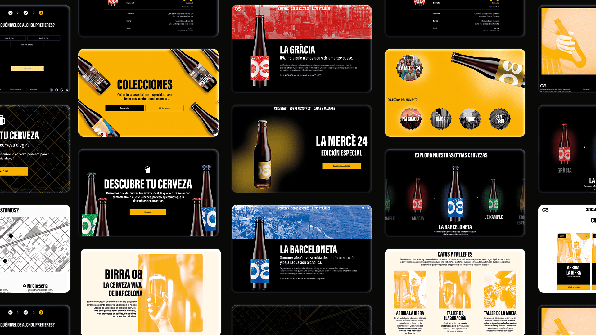
The beer range is structured into two main categories:
- Standard beers, inspired by neighbourhoods of Barcelona, representing everyday consumption and local identity.
- Premium collectible beers, linked to cultural events and key celebrations such as Sant Jordi, La Mercè or the Diada.
This product system reinforces the territorial concept behind 08, turning each beer into a collectible object connected to place, culture and experience.
The visual identity adapts across packaging, digital interfaces and product storytelling, ensuring coherence between the physical and digital brand.
INFORMATION
ARCHITECTURE
The information structure was redesigned to improve clarity, accessibility and navigation flow within the e-commerce experience.
Content hierarchy prioritises product discovery, differentiation between beer ranges and a frictionless purchasing process.
WIREFRAMES
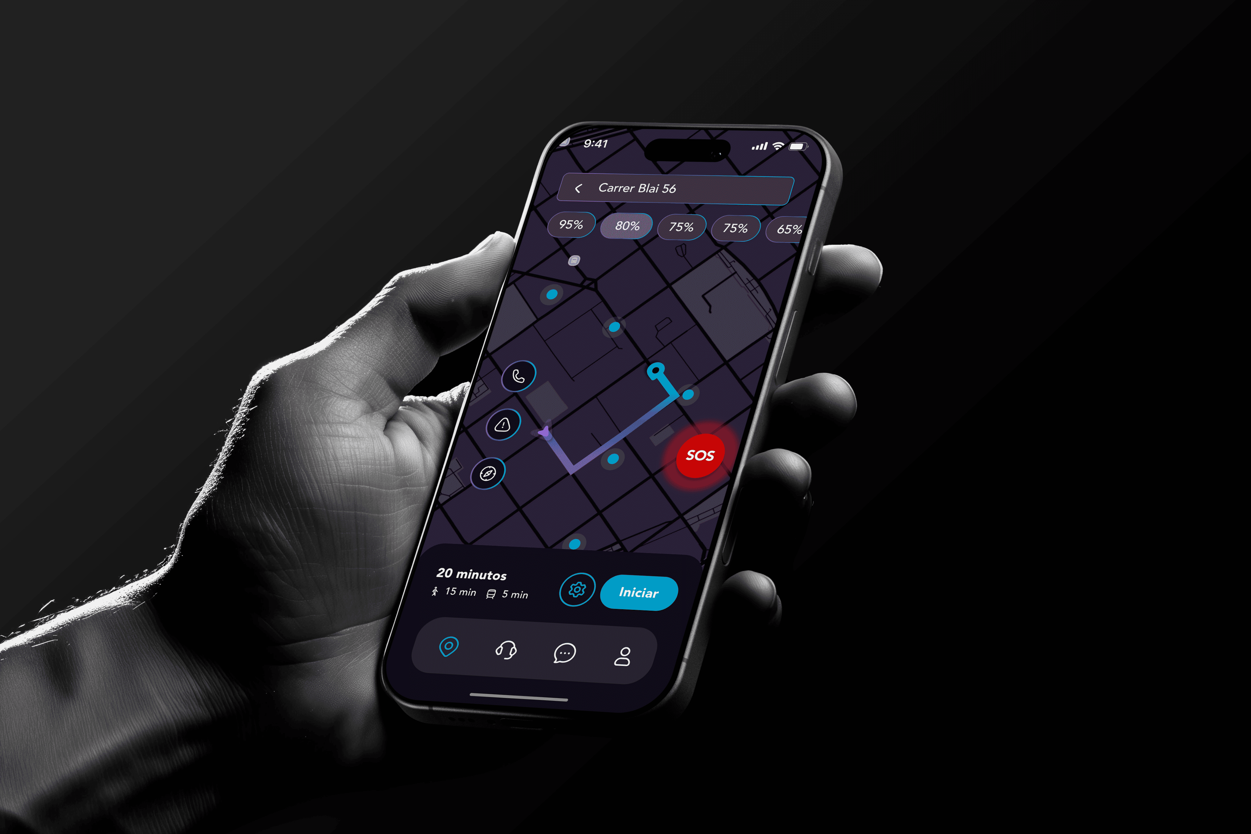
Low- and mid-fidelity wireframes were developed to test user flows, safety interactions and critical scenarios.
Special attention was given to emergency actions and route visualisation.
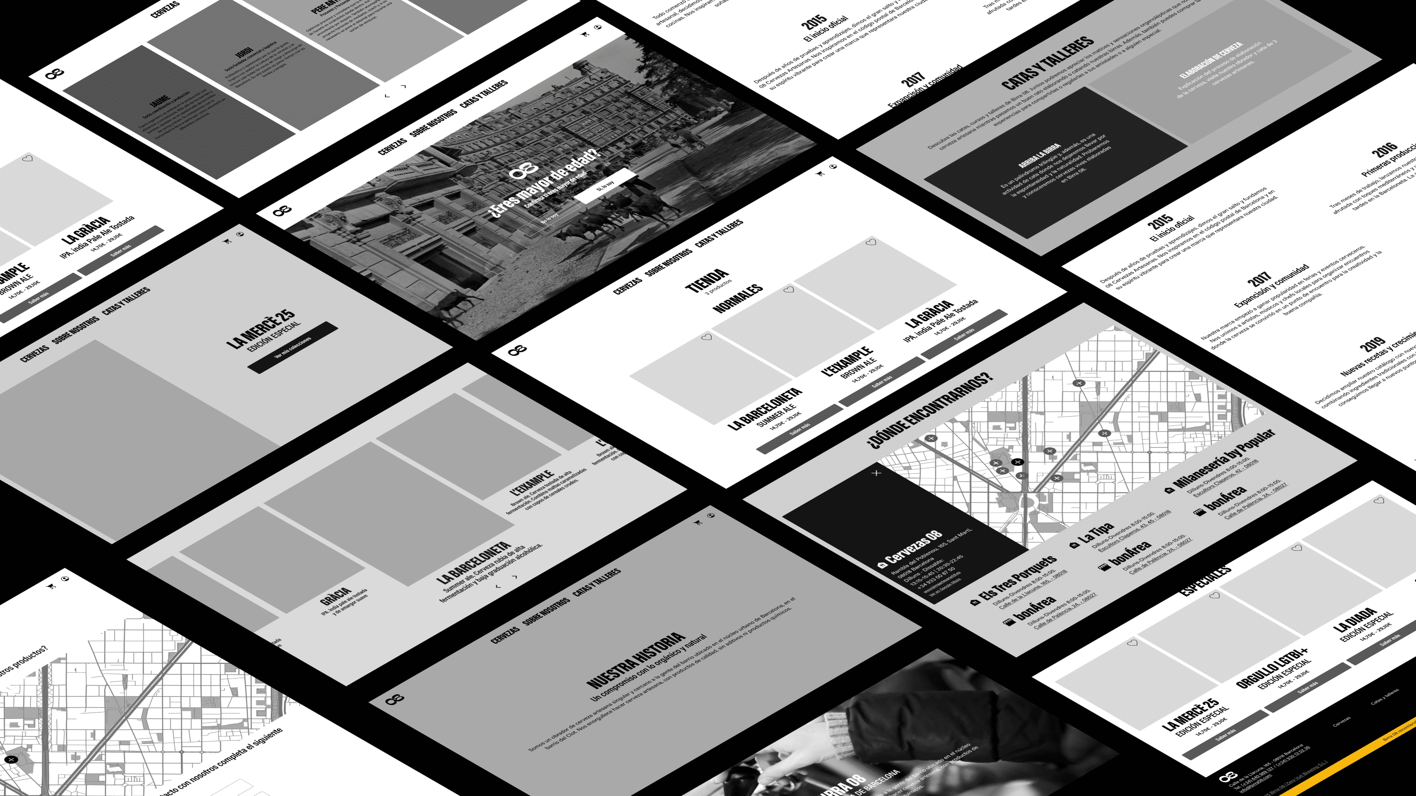
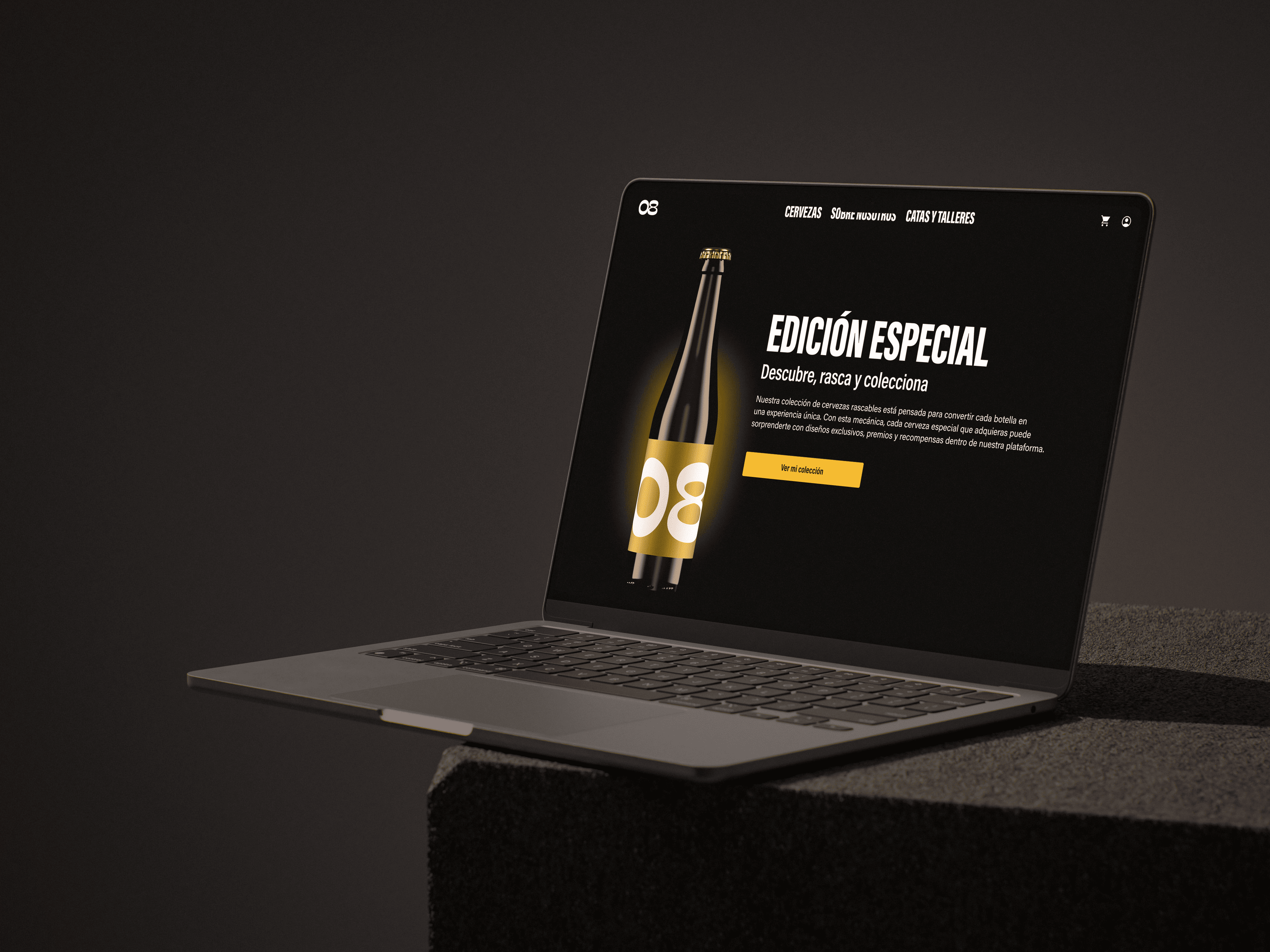
UI DESIGN
The interface combines a contemporary visual approach with references to traditional craft beer culture.
Bold contrasts, fermented yellow tones and clear hierarchy bring energy and freshness while maintaining brand authenticity.
3D product renders are integrated into the Home to enhance product presence and visual impact.
SELECTED WORKS
-
-
KIBITZ